Tips On How To Choose Pictures For Your Website & Cropping Them
Part of what we accomplish for our clients at Stigan Media is creating attractive and appealing websites that attract potential clients to your company based on the professional appearance of the site and the quality of its content. There are so many examples of poorly constructed websites out there, and the companies that run them do suffer in terms of traffic and overall return on investment. We prefer to take the time and the necessary steps to ensure each and every one of our clients gets a beautiful website with only the very best content. This endears you towards potential clients and will go a long way to keep your users happy in terms of your sites accessibility and overall attractiveness. How do we do it? By paying close attention to the details.
Why Don’t My Pictures Fit?
One major detail that people take for granted is the appearance of photos and pictures on your website. Right away, even the most basic internet user can tell if a picture really belongs in the space it occupies on a webpage, or if it has been stretched just to fit and take up blank space. Not only is this unattractive, it looks extremely unprofessional, and can actually cause people to question the integrity of your entire business. Say you have a website for a sports podcast, and you want to include a picture of a basketball somewhere on one of your pages. It is important to make sure that the original photo or picture file that you provide is cropped to fit the space that you want it to occupy, otherwise it will appear to look stretched and warped, and will become a major eyesore in the middle of one of your webpages.
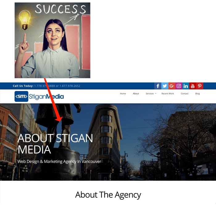
Let’s Use this pic as an example:
Notice the aspect of the image is a square?
Often times a client will ask us to use a square or a vertical image (tall & thin image) for a banner. We often have to tell them that this will not work, otherwise it will look stretched on the screen.
This is what it would look like if we added that pic in that spot:
See how the pic had to be cropped in order for it to fit to that aspect?
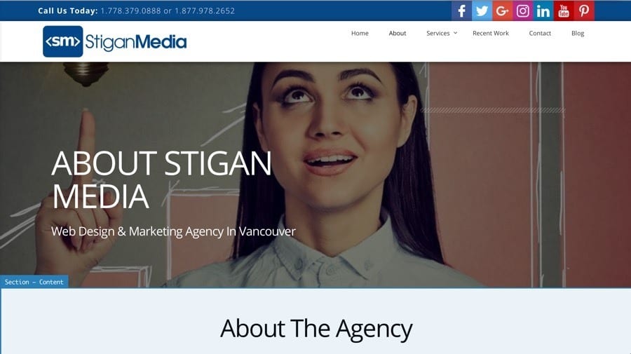
Now how would it look if we forced the picture to fit, without cropping?
See how stretched it looks?
Why does it do that? Well if you think about it, we are trying to fit a square into a rectangle, that is never going to fit. We either have to crop it or stretch the pic.
There are times when using a vertical or square image may be possible, but only works if our client is willing to choose a portion of the image to be shown. Of course, this means we are cropping the image. Generally, images with people will not work as (seen above) part of the person’s body will be cropped. This route works best with scenery or more abstract imagery.
Pictures and Different Screen Sizes
Now, this may seem simple enough — but there is another issue we have to keep in mind: screen sizes! Pictures, usually banner or background images, can be affected based on the size of screen that the user is viewing the website on.
If you are viewing your site on mobile, laptop or a large desktop screen, the background images used may appear larger or smaller. See below:
Desktop view

Laptop view
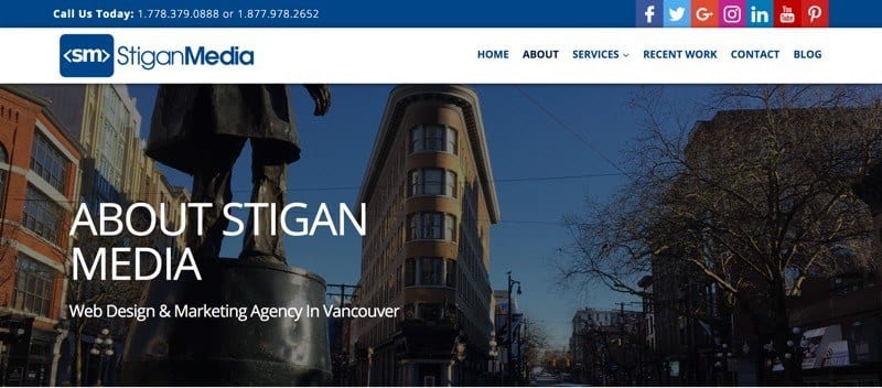
Mobile view

Notice how for all three screen sizes we are seeing a different area of the background image? This is because websites are responsive; they adjust based on screen sizes.
What we can do is choose the positioning of the image, ie: center, center top, right bottom etc. Based on your screen size, your image will follow those positioning instructions. However, the area of image shown will always vary based on screen sizes.
How To Choose The Right Pic For Your Website
Although we have to crop pics every once in a while, here are some tips on choosing pictures for your website.
- The bigger the better. The larger the picture is, the more space we have to crop, that means try to find higher resolution pics so in case we have to adjust we have a lot of room to.
- Try to find pics that have the main areas you want to feature in the middle of the pic, so try to look for pics that are zoomed out.
- Try to find a pic that has a similar aspect. Often times you will never find a pic that has the exact aspect, but if you get it as close as you can, this will be easier to work with.
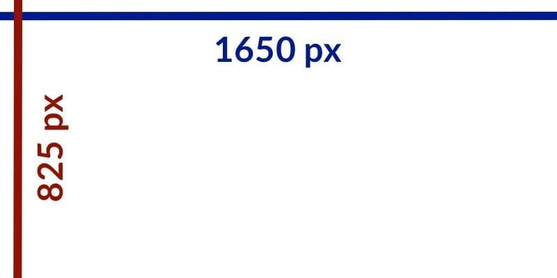
- We can always provide you with dimensions to keep in mind. For banner images, we usually suggest a 4×2 image that is at least 1650px wide, so 1650px by 825px would be ideal!
Most photos can look perfect with just a little bit of cropping, so don’t be discouraged if you find a photo that doesn’t initially fit the space you want, just crop it using the preset aspect ratios! For more helpful tips like these, feel free to follow Stigan Media on Facebook and Twitter where we post all of our latest updates. You can also contact our web design company directly if you are interested in having your own website professionally built by a team of talented digital marketing experts. We offer free consultations, and would be happy to hear from you!
Stigan Media is an award-winning web design & marketing agency specializing in WordPress, WebFlow, and Shopify. Our team focuses on SEO, PPC and conversion optimization strategies to help your company grow.


 Get in touch

